

NOTHING'S OPEN is an exclusive dining reservation platform designed for users who want effortless access to the most sought-after restaurants. Unlike traditional booking apps, the experience is built around exclusivity, speed, and a refined visual language that signals premium hospitality from the very first tap.
PROJECT TYPE:
Consumer Facing Product
Dual-Market Product
Web-Based
PROJECT ROLE:
Lead UI/UX Designer
YEAR:
2023
SKILLS:
UX/UI
User Research
Wire Framing
Prototyping
Design System & Guidelines
Usability Testing & Analysis
Project Management
Business Strategy
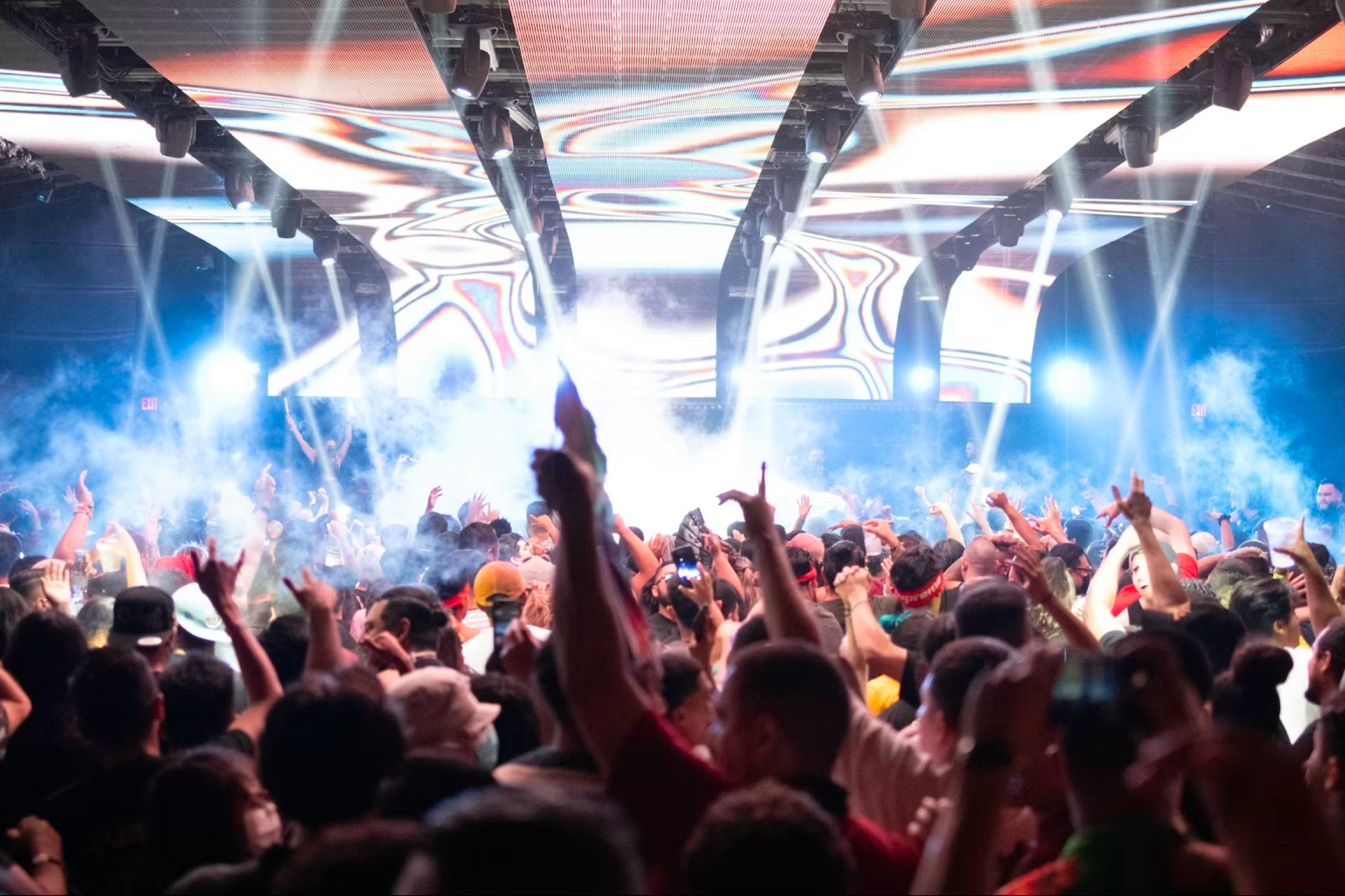
SOME RESTAURANT RESERVATIONS ARE HARDER TO SNAG THAN EVER BEFORE
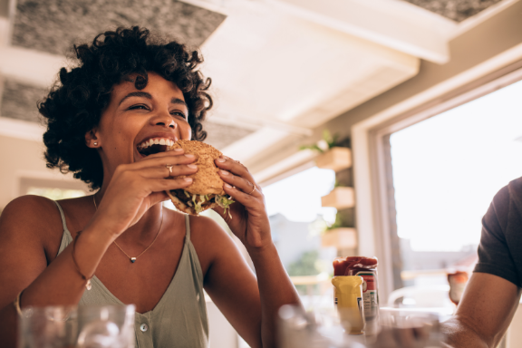
Snagging a table can sometimes be particularly challenging depending where you live or where you’re visiting. If you don’t have a reservation a week—or even a month—in advance, your likelihood of scoring a table at a popular restaurant in a densely populated city is pretty low.
RESTAURANTS ARE LOOKING FOR NEW WAYS TO SET THEMSELVES APART FROM THE PACK
The hospitality industry is equal parts competitive and innovative. With restaurants popping up left and right, restaurateurs have realized the importance of offering something extremely unique to meet this new demand.
What was broken:
Issue 01
High-demand reservations disappeared within minutes
Top restaurants release reservations weeks ahead and they vanish in minutes. Diners who weren't watching the clock missed out — even when they were ready to pay.
Issue 02
Existing platforms didn't price for scarcity
Traditional platforms like OpenTable and Resy treat every reservation the same way — first-come, first-served. Diners willing to pay more had no way to express that demand, and restaurants had no way to capture it.
Issue 03
Concierge services were opaque and expensive
High-end concierge services existed for premium diners, but they operated as black boxes. Pricing was hidden until after the booking. Trust was built person-by-person, not at scale.
Issue 04
Restaurants couldn't capture the demand they generated
When a $250 tasting menu is impossible to book at face value, the secondary market captures the upside. Restaurants generated the demand but watched the value flow to resellers and brokers.
Issue 05
Premium hospitality lacked a premium digital experience
Even at the highest end of dining, the booking experience felt generic. The contrast between the in-restaurant moment and the digital flow that led to it was jarring — and the brand suffered for it.
WILLING TO PAY MORE
According to Eventbrite, 75% of diners would pay more money for a better dining experience.
SOLUTION:
NOTHING'S OPEN is a premier, exclusive dining reservation platform that provides a unique and unmatched experience for effortlessly securing reservations at the most popular restaurants. Our platform ensures a dining journey that is both extraordinary and tailored to individual preferences.
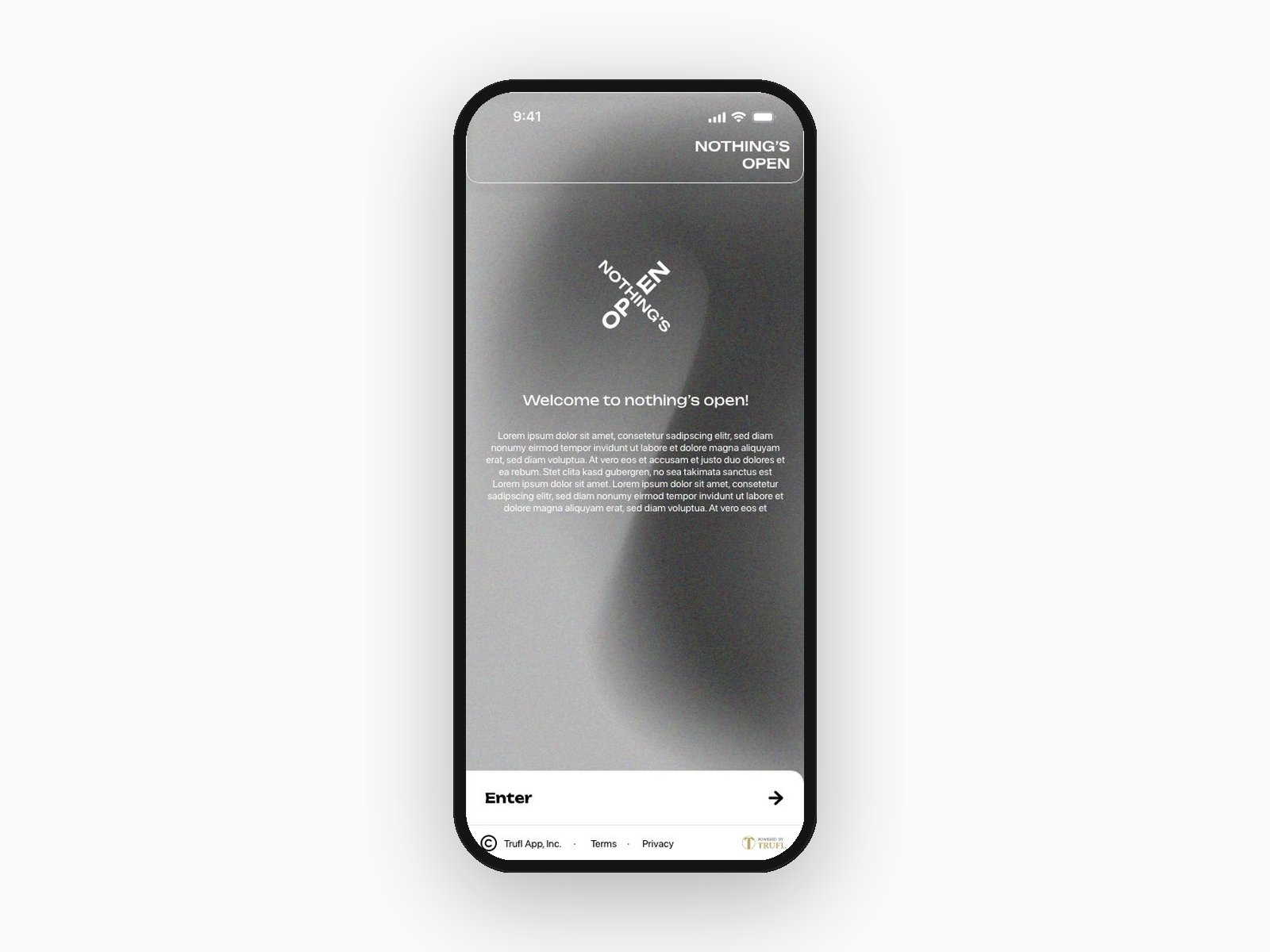
Establishing premium tone from the first interaction
A minimal, brand-led entry with the rotating NOTHING'S OPEN mark and a single clear CTA. The grayscale palette and editorial typography establish the premium tone before any content loads.
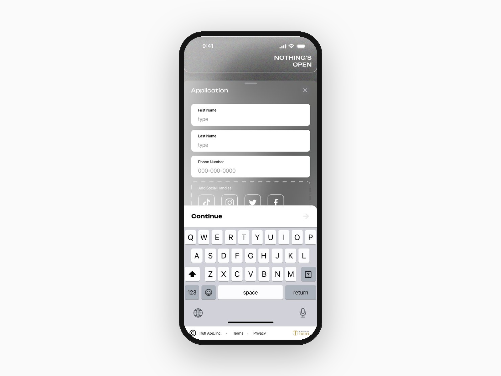
Sign-up designed around existing social behavior
A short, gated form (name, phone, social handles) reinforces the invite-only positioning. Social handle integration with TikTok, Instagram, Twitter, and Facebook makes onboarding feel native to how this audience already lives online.
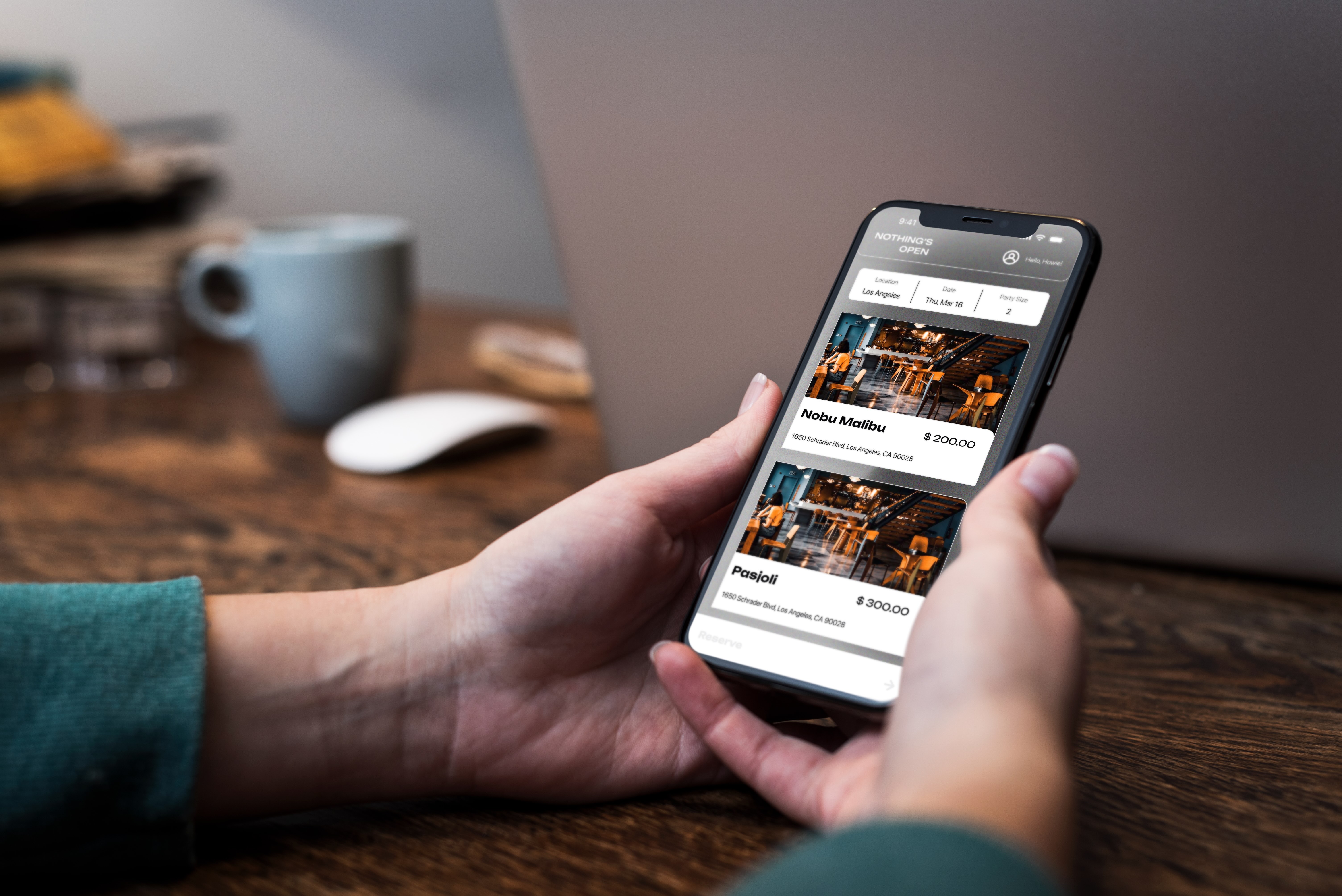
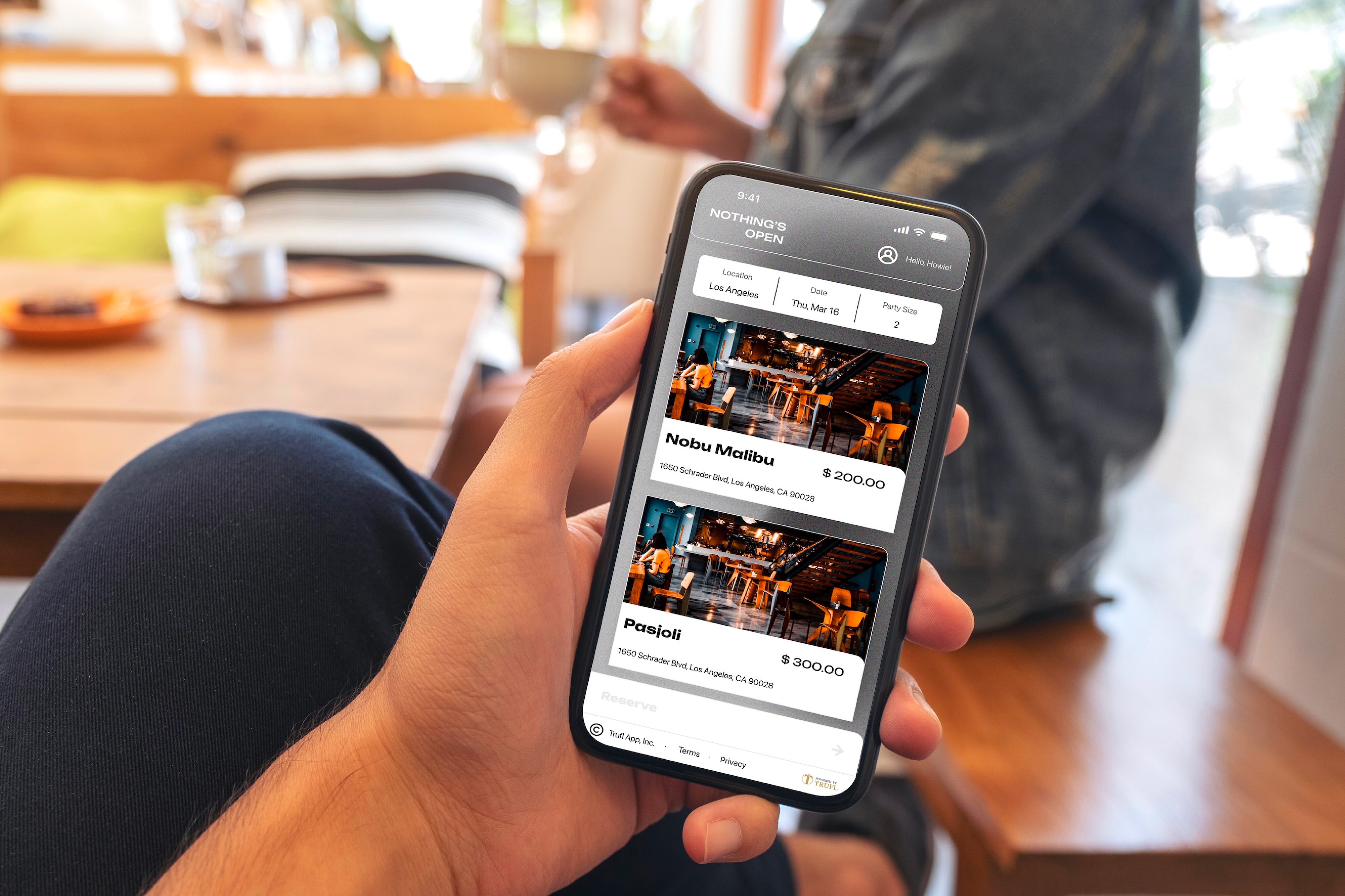
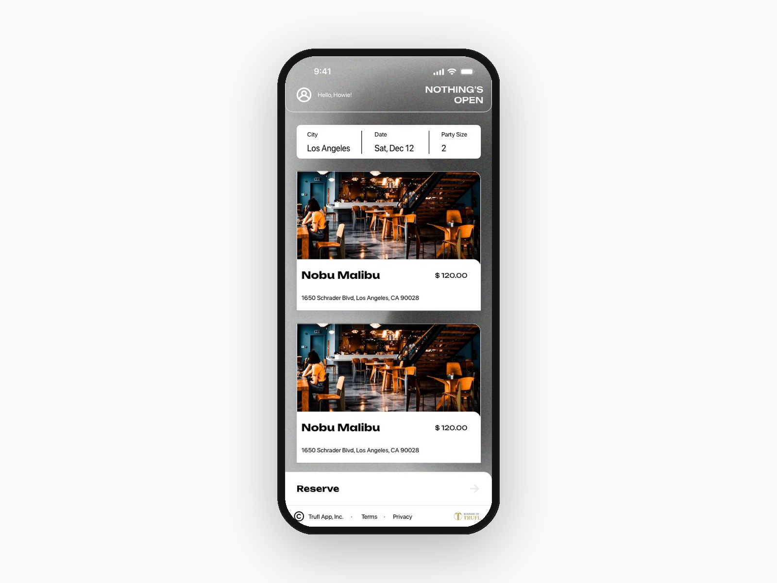
Discover — a curated guide, not a directory
A personalized home view with city, date, and party size at the top. Restaurants appear as large, image-forward cards — making browsing feel more like a curated guide than a directory.
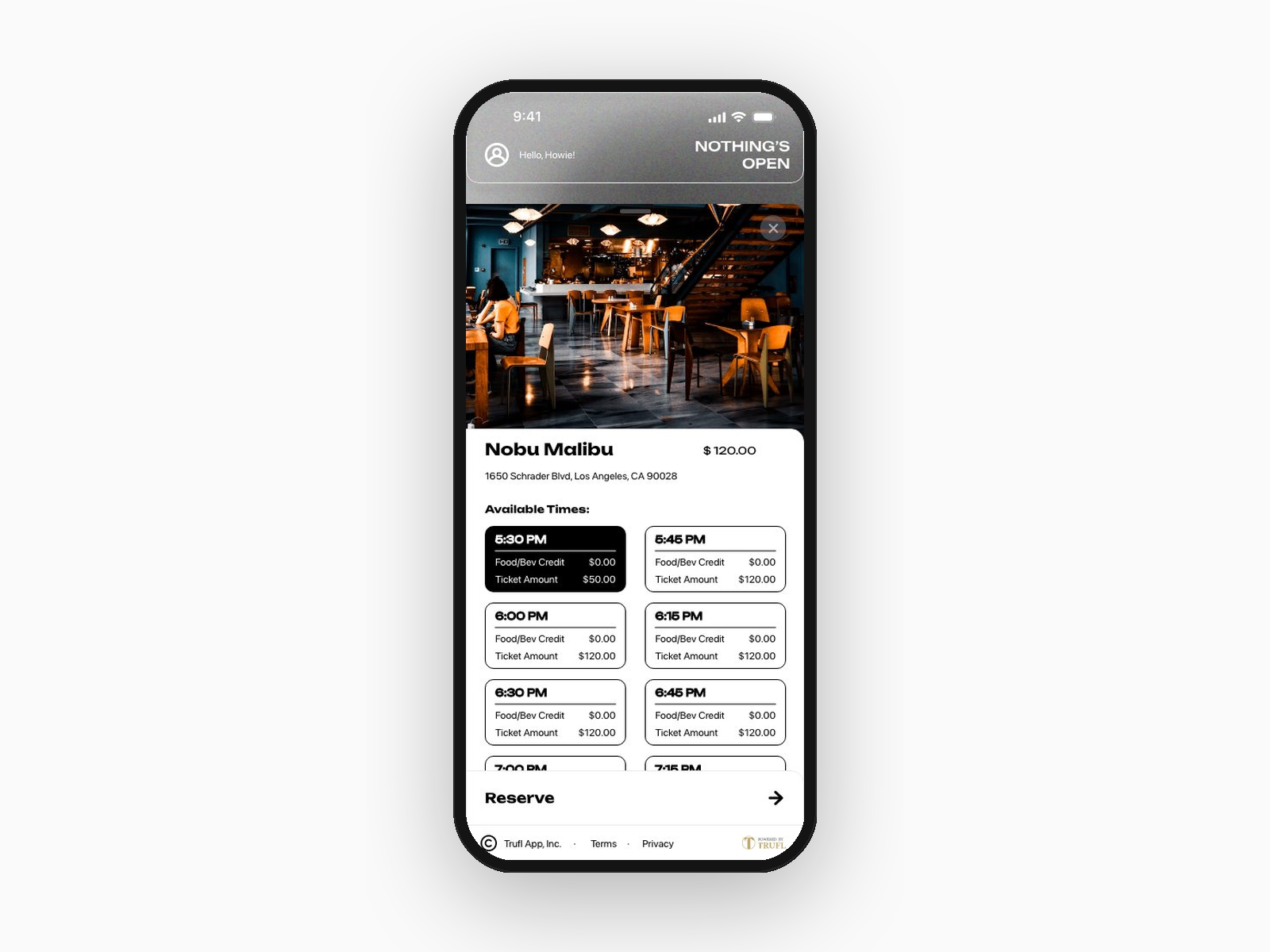
Time slot selection — transparent pricing at the moment of choice
Reservation times shown in a clear grid, each with food/ bev credit and ticket amount transparently broken out. Selected slots invert to black for immediate visual feedback.
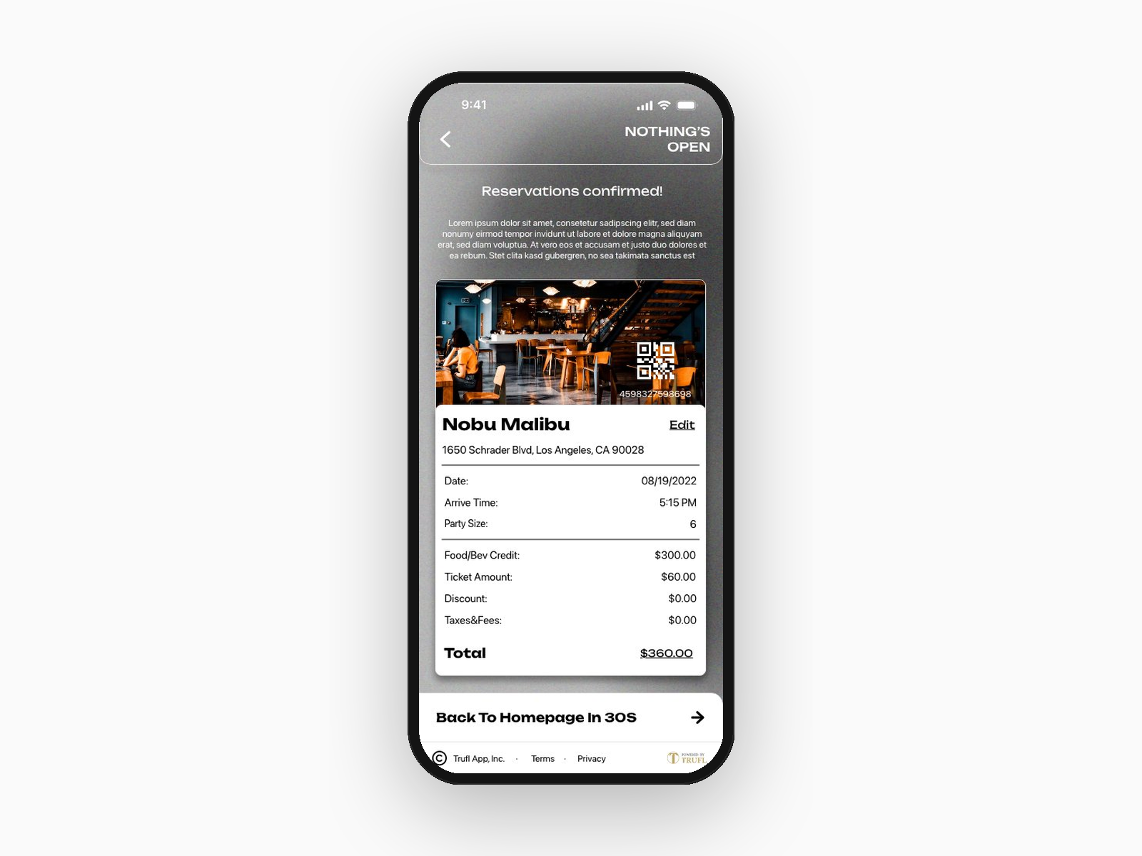
Reservation confirmation — a receipt, not a confirmation modal
A receipt-style confirmation with restaurant photo, QR code for entry, full itemized total, and a 30-second auto-redirect. Designed to feel tangible — like a ticket worth showing up for.
DESIGN DECISIONS:
Decision 01
Premium editorial visual language
Heavy whites, generous spacing, and restrained typography put restaurant photography front and center.
Decision 02
Persistent bottom CTA pattern
The anchored bottom action ("Continue," "Reserve," "Back to Homepage") reduces decision fatigue throughout the flow.
Decision 03
Transparent pricing as a two-sided lever
Surfacing dood and bev credit and ticket amount up front builds trust around a pricing model that's often opaque in this space.
Decision 04
Personalization integrated into the flow
Personalization (location, party size, social profile) is woven into the flow rather than buried in settings, supporting the brand promise of an experience built around the individual.
Decision 05
Seamlessly designed for both diners and restaurant partners
Built to support both diner and restaurant partner experiences across the broader Trufl product ecosystem.
OUTCOMES:
Premium hospitality, productized
The product launched in 2023 and was actively used by diners and restaurants until TRUFL closed. Hard launch metrics weren't preserved publicly, so what's shown here is the design impact — the kind of experience the work actually delivered.
Diner side
Tap → Reserve — a booking flow that felt like an experience
Brand-led entry, transparent pricing, and a receipt-style confirmation made the act of reserving a restaurant feel designed, not transactional. Closer to buying a ticket to a show than checking out of an e-commerce site.
Restaurant side
Dynamic pricing as an actual operational tool
Restaurants gained a real lever for shaping demand — setting Food/Bev minimums and adjusting Ticket Amounts to pull customers into quieter hours and capture value during peaks.
Brand
Premium tone, set in seconds
The editorial visual language — grayscale palette, restrained typography, image-forward layouts — earned the price point users were being asked to pay. The brand stood up to the experience.
What it taught me :
The product didn't get a long runway, but the work shaped instincts I carry into every project that follows.
Lesson 01
Premium pricing means premium scrutiny
When users pay an access fee, every detail has to earn it. Transparent pricing, the receipt-style confirmation, the persistent CTA — "good enough" stops being good enough.
Lesson 02
Transparency is a marketplace lever, not just a UX feature
Showing Food/Bev Credit and Ticket Amount upfront built trust with diners — but the same system gave restaurants a real tool for shaping demand. Good UX served as a marketplace mechanism.
Lesson 03
Shipping isn't the end of the work
Watching how users actually moved through the booking flow — and where they didn't — shaped my instincts for the next thing I'd design. Post-launch observation taught more than any usability test before launch.
What it pointed toward
Access as a category, not just a feature
Scarcity is the new luxury — restaurants were just the first vertical we explored. Hotel suites, private clubs, sold-out shows, members-only sports — anywhere scarcity creates a secondary market, a transparent first-party platform can replace it. It's the kind of thesis I'd want to keep designing toward.